私はいつも、武内直子の作品への大胆なアプローチに感銘を受けてきました。彼女は、少女ジャンルで活動する他の多くのアーティストよりも、限界を押し広げることを恐れませんでした。美しい写真だけではありません。すべての形や色は意図的に作られているように感じられ、キャラクターの強さ、悲しみ、または変化するために犠牲にしたものを暗示しています。実際、彼女のデザインは単に物語を描いているのではなく、 物語そのものだと私は思います。
このシリーズの最高のキャラクター デザインで私が本当に気に入っているのは、竹内氏が視覚的なコントラストを使ってストーリーを語る方法です。素晴らしいですね!キャラクターが見た目が優しくて無邪気であればあるほど、その悲しみや痛みはより強くあなたを襲います。そして竹内氏は、変身を単純な衣装の変更としてだけではないと考えていました。新しいフォームはそれぞれ単なるパワーアップではなく、そのキャラクターを見る全く新しい方法でした。アップグレードするたびにデザイン作業が倍増して、ストーリーに層が追加されるようなものです。とても賢いですね!
Usagi Tsukino’s Classic Design Makes Weakness Look Like a Weapon
Takeuchi’s most striking design choice for Usagi is surprisingly simple: her twin buns and sailor uniform make Sailor Moon appear more delicate and youthful than the other fighters. The colors – white, gold, and a soft pink – traditionally represent vulnerability in shojo manga and anime. This contrast is key: because she doesn’t look like a powerful warrior, every time Usagi steps up to face a challenge, it feels especially impactful.
When Usagi transforms into Princess Serenity or her Eternal form, it’s a significant visual shift. Takeuchi, the artist, consistently maintains the same basic body shape, but drastically changes her overall appearance to reflect a new level of power. This happens with every upgrade Usagi receives: her new forms always appear more delicate, elaborate, and wedding-dress-like, creating a contrast with the increasingly dangerous situations she faces. It’s a deliberate choice to move away from a traditionally ‘battle-ready’ look.
Princess Serenity’s Minimalism Makes Royalty Feel Like Tragedy
Takeuchi designed Princess Serenity’s outfit as a simple, long white gown, removing most of the battle accessories associated with Sailor Moon. This creates an impression of deep sadness rather than strength. Serenity’s appearance immediately suggests sacrifice and loss, even before the story reveals it. Within the visual style of Sailor Moon, the white color emphasizes mourning and vulnerability, implying that a loss has already occurred, rather than simply representing purity.
Compared to her more detailed future appearance as Neo-Queen Serenity, the Silver Millennium version of Princess Serenity seems intentionally delicate. Naoko Takeuchi cleverly realized that the fall of the Moon Kingdom is most impactful when its princess appears least able to withstand it.
Black Lady Shows How Chibiusa’s Corruption Registers as a Wound
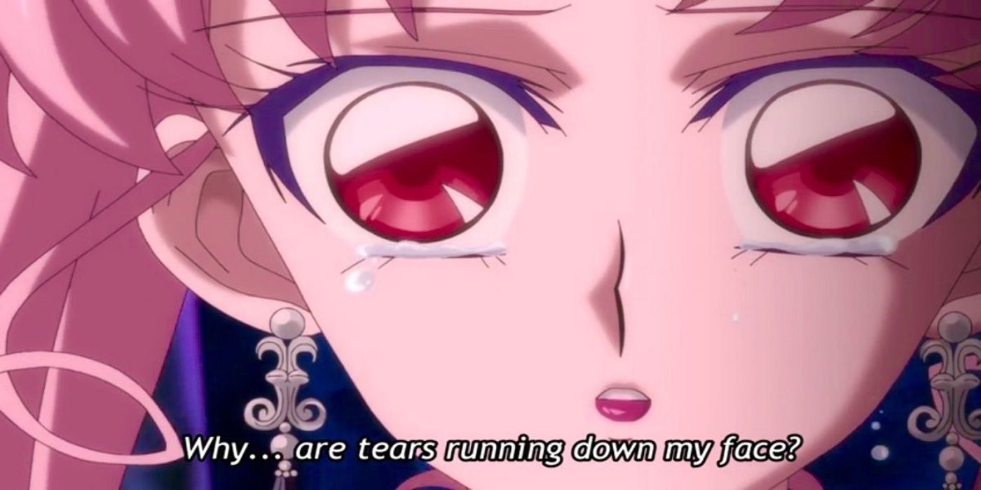
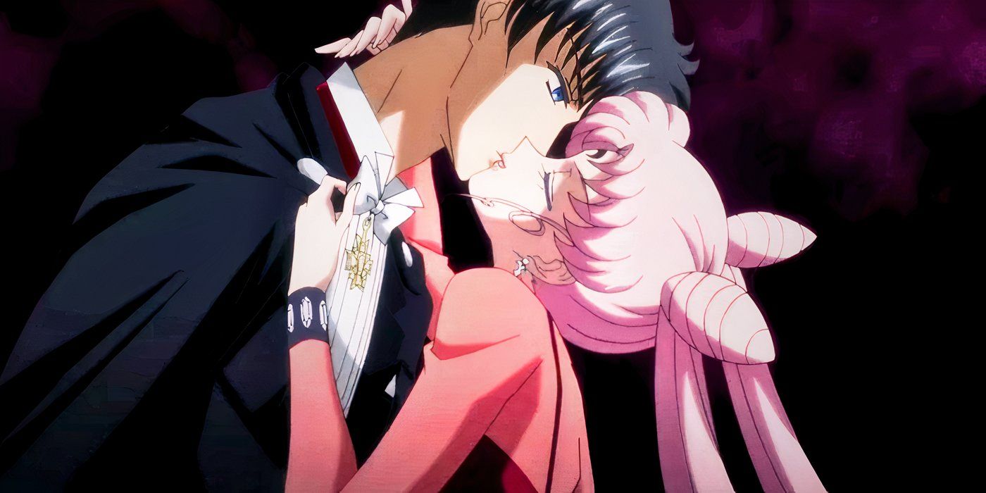
Takeuchi intentionally designed Black Lady with the body of an adult but the face of a child, highlighting the trauma Wiseman caused. This makes Black Lady unlike most villains; she appears as a wounded child pretending to be an adult.
The dark purple dress and fancy earrings are reminiscent of Sailor Moon’s style, but twisted and darkened. While Sailor Moon’s colors feel warm and inviting, Black Lady’s colors are cold and suggest injury. Black Lady represents a possible future for Usagi, showing what she might become if she’d fallen under the wrong influence.
Sailor Saturn’s Design Communicates Finality Rather Than Combat Readiness
Hotaru Tomoe, as Sailor Saturn, has a very different look compared to the other Inner Senshi. Her dark purple and white uniform, along with the Silence Glaive and recurring Silence themes, creates a sense of finality and destiny. Unlike the other Sailor Guardians who fight battles, Saturn appears as a figure who brings things to a close.
Naoko Takeuchi designed Sailor Saturn with a surprisingly simple color palette of dark purple and black. This understated design makes her few full uniform appearances feel truly threatening, without needing flashy details. While most Sailor Guardians gain emotional impact through frequent appearances, Saturn achieves it through her rarity. Her design is carefully crafted so that every time you see her, it feels like a sign of danger.
Sailor Uranus Collapses the Gender Binary Right Into the Silhouette
Haruka Tenoh’s character subtly demonstrates something the series never directly states. Like the other Sailor Guardians, Uranus wears the standard uniform, but her appearance and demeanor are distinct. Creator Naoko Takeuchi intentionally designed Haruka to defy the established visual norms of the show. When dressed as a civilian, she appears masculine, but in her Senshi uniform, she transcends traditional gender presentation, embodying both and neither.
Uranus’s color scheme of navy blue and gold helps her stand out from the other Sailor Guardians without making her appear evil. This unique look reflects her position as a warrior who doesn’t play by the same rules as Usagi’s group.
Sailor Neptune Uses Elegance as Armor Rather Than Decoration
While Uranus embodies strength and a blend of masculine and feminine qualities, Michiru Kaioh’s design is intentionally and strikingly feminine. Takeuchi presents this femininity not as inherent, but as a deliberate strategy. Her deep blue color scheme, long, flowing hair, and calm demeanor create a character who wields beauty as a weapon, much like other Sailor Guardians use physical strength.
Haruka and Michiru were intentionally designed as a striking visual duo. Takeuchi created them to appear different outwardly, while still sharing the same strong values, making both characters stand out more. While Neptune’s outfit isn’t much different from the other Outer Senshi, Takeuchi’s portrayal of her body language and expression gives the impression she always knows what will happen.
Sailor Pluto Has a Design That Embodies Isolation
Setsuna Meioh’s dark green hair, black details, and Garnet Orb staff create an image of someone deeply connected to the fabric of time and space – almost as if being separate from it has become her natural state. Unlike the other Sailor Guardians who are often seen together, Pluto’s design is meant to emphasize her solitary nature; her full appearance only makes sense when she is alone.
The Garnet Orb’s burgundy and deep red details add a surprising warmth to an otherwise cool color palette, making them stand out intensely. This reflects Takeuchi’s design of a character who possesses warmth, but remains emotionally distant – a trait consistently reinforced by her role as an eternal guardian.
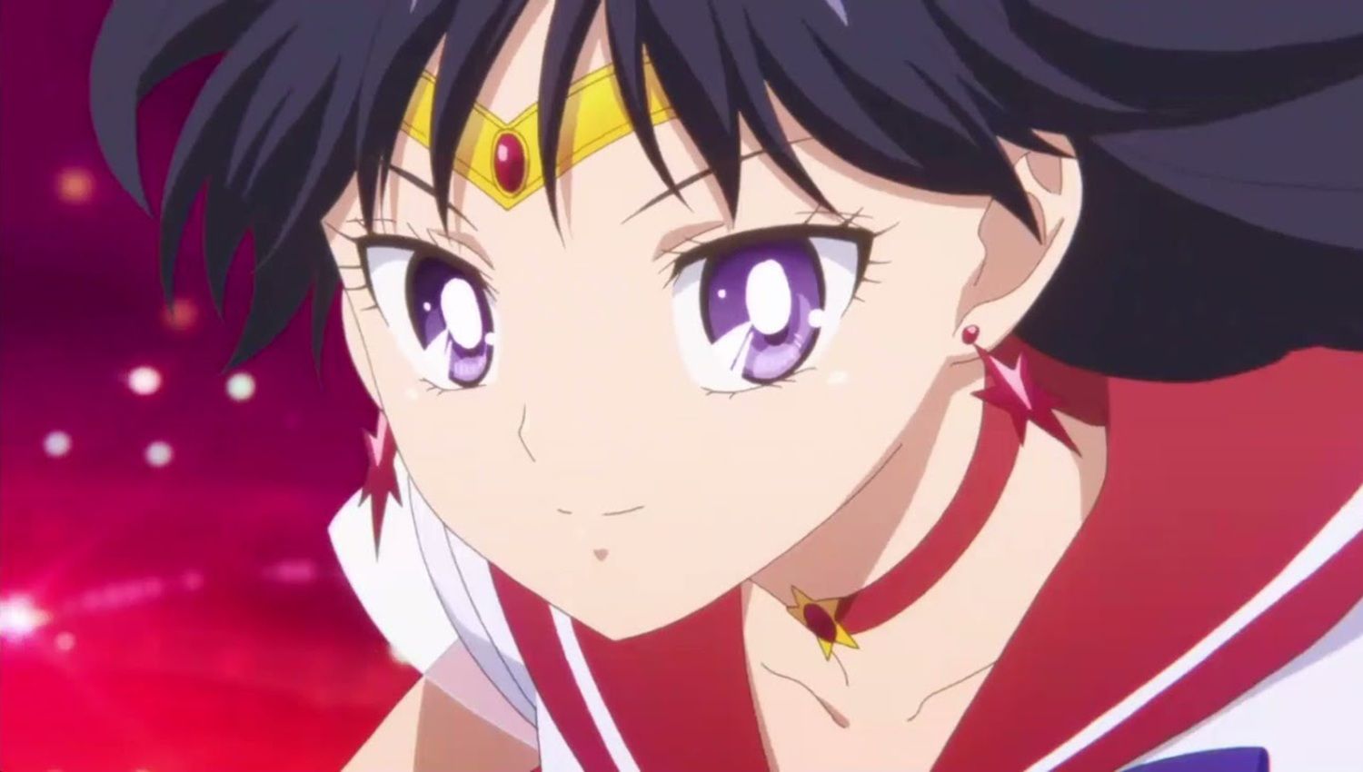
Sailor Mars Shows That Rei Hino’s Power Reads as Precision Not Chaos
Rei Hino’s uniform, with its rich reds and purples, and Takeuchi’s consistent depiction of her dark hair and strong facial features, create a character who seems powerfully in control, not wild or unrestrained. This makes her fire-based attacks feel intentional and precise, rather than simply impulsive – a key difference among the many passionate fighters in the series.
I’ve always noticed how Takeuchi’s design choices really emphasized Rei’s connection to her role as a shrine maiden. Whether she’s in her miko robes or her Sailor Scout uniform, she feels like the same person, just expressing that spiritual power in different ways. It’s a key part of what makes her character so consistent and compelling throughout the series.
Sailor Aluminum Siren Looks Like Someone Playing a Role She Did Not Choose
In the Sailor Stars season, Aluminum Siren is unique among the Sailor Animamates. Creator Naoko Takeuchi cleverly designed her corruption to be visually apparent in her appearance without making her look frightening. Her color scheme of silver and light blue, along with her feathered earrings and elegant style, create a villain who seems to be acting loyal to Sailor Galaxia, rather than genuinely believing in her cause.
Siren’s feathers stand out because their lightness contrasts sharply with Galaxia’s imposing golden armor, creating a sense that she exists in a more open and unrestrained space. She appears dressed as a villain, rather than naturally being one, a point later confirmed by Sailor Stars. Her design is a clever visual statement, suggesting sadness through beauty instead of relying on darkness, making it one of the more thoughtful examples of character design in the series.
Sailor Galaxia’s Design Claims the Visual Territory of the Silver Millennium for Destruction
Naoko Takeuchi created Sailor Galaxia as an incredibly powerful warrior, visually striking with golden armor that suggests both strength and royalty. She’s so powerful, in fact, that the typical Sailor Senshi uniform doesn’t quite fit her. While her outfit shares some elements with the other Senshi, Galaxia is unique in wearing a complete suit of armor. Her design makes it clear she’s a character who breaks all the established rules of the Sailor Moon universe, even the visual ones.
Gold is a prominent color in Galaxia’s design, and throughout Sailor Moon, it represents the Silver Millennium and Usagi’s fate. Galaxia hasn’t just gained power; she’s taken over the visual symbolism of goodness within the series and twisted it to serve her destructive goals. Usually, Takeuchi doesn’t rely so heavily on a single color to convey meaning, but in Galaxia’s story, the use of gold communicates more than entire story arcs could.
- USD JPY 予想・見通し・の予想
- CNY JPY 予想・見通し・の予想
- GBP JPY 予想・見通し・の予想
- EUR JPY 予想・見通し・の予想
- USD VND 予想・見通し・の予想
- ジニー&ジョージア州シーズン 4 は、シーズン 3 のゲームを変えるクリフハンガーの後、大幅な制作アップデートを実施
- モデルOpenRouterの認証中のエラー:Anthropic/Claude-3-Sonnet:Puter.js APIによって制限されたレート。 60秒後に再試行してください。
- BTC 予想・見通し・の予想. BTC 暗号通貨
- JPY KRW 予想・見通し・の予想
- 「プロジェクト ヘイル メアリー」が Amazon Prime Video でストリーミングされる時期
2026-05-21 17:42